When I revealed the cover for Loyalty: Washington Square Secrets 3 in my readers’ group, one person asked about my cover design process. As a fellow author, this reader (hi, LB) is interested in the creation of all parts of a book. So, here’s a rundown of my current cover process—and a cover reveal for those who haven’t seen Loyalty yet. I think it’s fabulous, especially alongside the others.
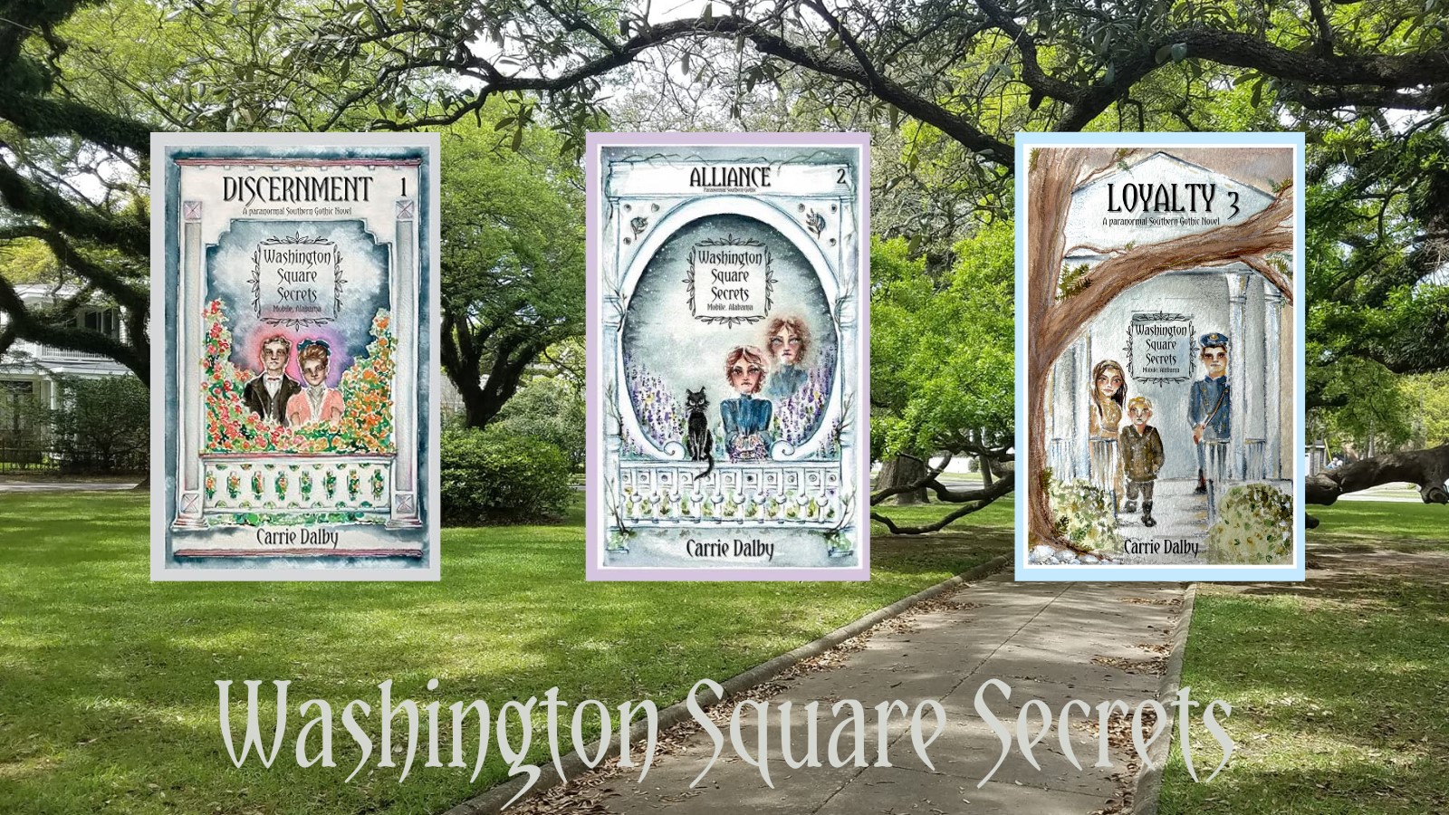
For The Malevolent Trilogy and Washington Square Secrets books, I commissioned local Mobile Bay artist Amanda (Shelley Bones Art) to do watercolors for each. Besides already knowing her in person, I chose Amanda based on the paintings she shared on her Instagram account. (You can commission her to paint your house, pet, etc. when she has openings.) She has a whimsical Gothic vibe on many of her art pieces, which works well with my books.

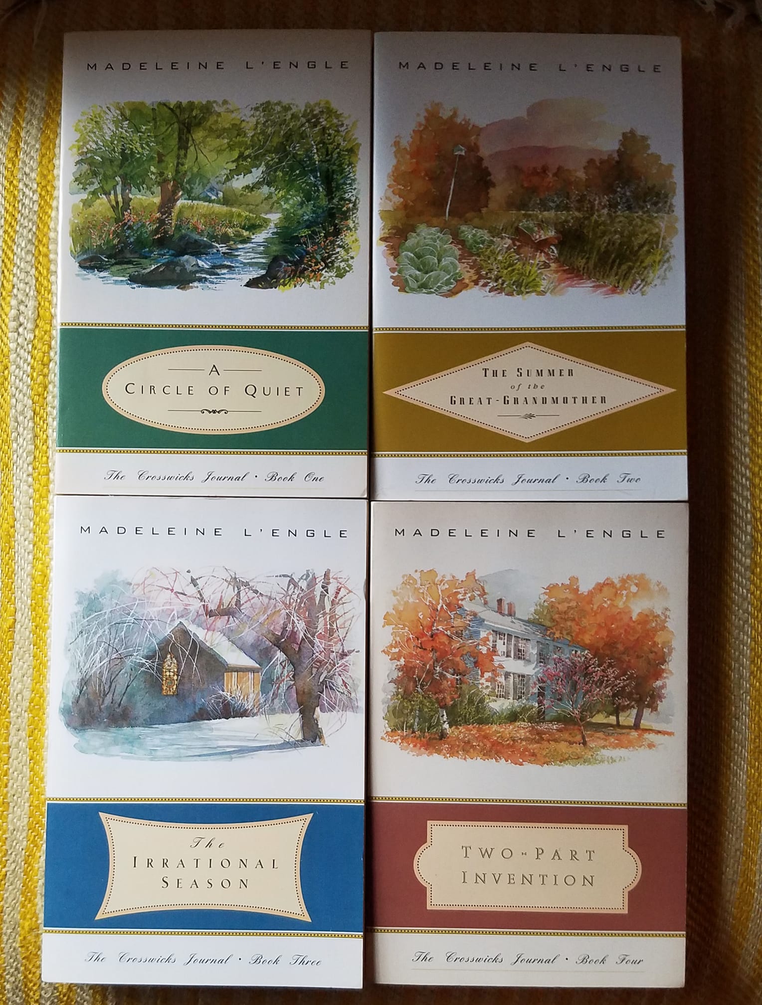
The covers of The Crosswicks Journal series by Madeliene L’Engle, one of my all-time favorite authors, was an inspiring factor of The Malevolent Trilogy. I gave Amanda photos of the actual houses I wanted a painting of, as well as their addresses so she could drive by them if she wanted. Plus I showed her what I was going for with the example of the books. I designed the cover layout myself, inspired by the quartet of books by Madeleine L’Engle. You don’t often see books covers like this anymore. I think they’re gorgeous.
For Washington Square Secrets, I shared photos of the houses/addresses, visual inspirations for the characters, as well as their likes, hobbies, and the main themes in the book.


Amanda managed to incorporate the architectural details of each home with the characters for the watercolors of Washington Square Secrets. She also left space enough for me to add in the title and other needed text since the pictures would take nearly all the cover space, unlike the trilogy.

Armed with a template from the printer/distributor that gives things like spine thickness based on page size and count, I do the layout design through the Canva website. (I use Canva Pro for the covers and my visuals/teasers/promos like the ones shared in this post.)

I decided to keep with the font used on The Possession Chronicles called “Yataghan” to help visually link the different series books as they are all adult historical Southern Gothic. It’s also used on Masked Flaws and Other Stories, a collection of historical Southern Gothic shorts. Only my two teen novels, Fortitude and Corroded, do not have it.
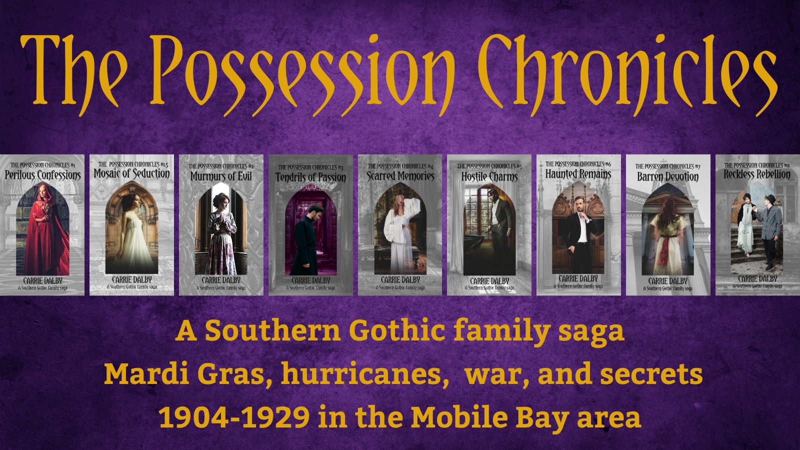
I did the layout for these covers using the first edition cover visuals (purchased from Deposit Photos) set inside a Gothic arch,
with a gray-toned backdrop of the characters’ backgrounds.
The Possession Chronicles font was chosen for the first editions of the series by cover designer Ashley Byland based on me wanting a retro/pulpy Gothic romance vibe. It’s a free download you can find online and then upload into word and design programs. As I’m not a professional graphic designer, the process can be hit and miss at times. (The Loyalty cover took me three tries to get it to the right specifications with the “bleed area” numbers factored in. That’s always my downfall—the math part.)
Overall, I’ve found satisfaction in the visual art side of the literary journey. It’s allowed me to apply the art appreciation and techniques I studied when in school and those things I’ve learned through reading and experiencing life. The good far outweighs the minor frustrations—at least for my own work. I’m happy to talk more about this process. Questions and comments are welcome.

Leave a comment